Inks & Ivory
Inks and Ivory – Hero Section Redesign & Site Refinement
Role: Visual & UI Designer
Tools Used: Webflow, Figma, Capcut
The goal for this project was simple but bold: create impact.
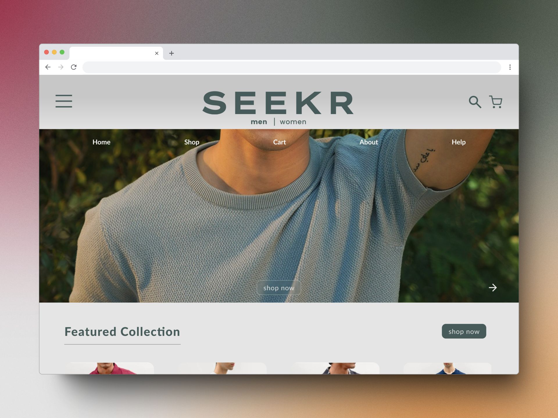
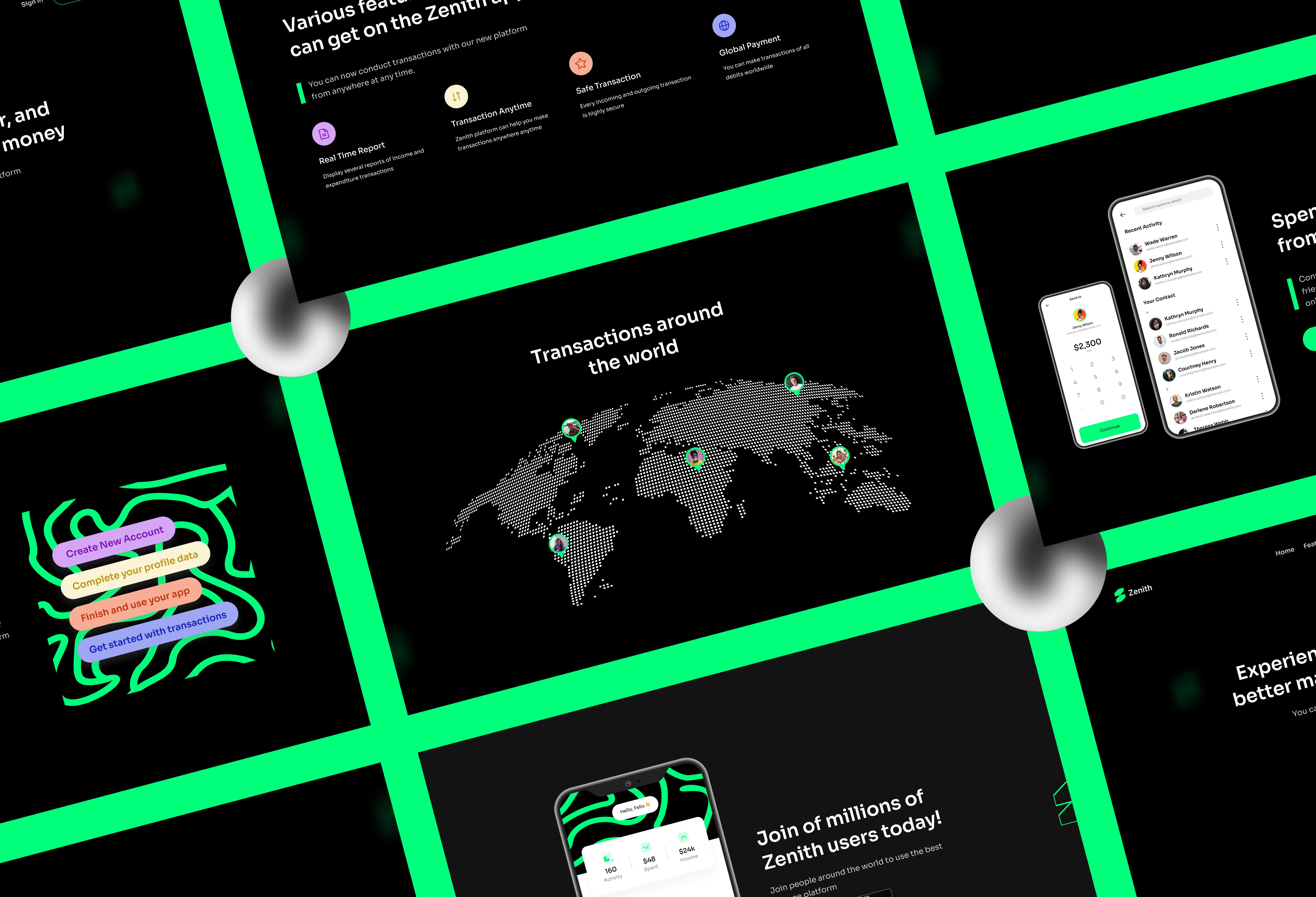
The client for Inks and Ivory didn’t want messaging or meaning in the hero section — just a striking visual that captures attention instantly. To deliver on this vision, I designed and animated a 3D liquid-inspired shape that morphs and flows as the user lands on the site. The animation was crafted to feel fluid and organic, subtly nodding to the brand’s name — Inks and Ivory — without being overly literal.
Beyond the hero, I also made a series of minor but meaningful adjustments throughout the site to improve consistency, alignment, and overall polish. This process gave me hands-on experience with Webflow, allowing me to better understand its capabilities for building and refining high-impact websites.
01
Problem Statement
02
Brand Identity
Our brand identity is clean, modern, and tech-savvy, reflecting the simplicity and convenience of our app. The colors should be simple and bold, with a focus on greens, reflecting trust and reliability. The logo should be clean and simple, with a strong, memorable icon that reflects our app's core functionalities.
03
Typography
We love the Sora typeface for it’s softness, rounded strokes, and it’s unique friendly look. It is versatile for display, headlines, digital design, and prints.